PageUni Countdown Timer supports responsive design. This means your timer bar automatically adjusts its layout and style to fit different screen sizes—from small smartphones to large desktop monitors, your timer bar on store pages will always look good and work well.
When you're customizing the design, the PageUni Countdown Timer's timer builder uses a mobile-first approach—it starts with small screens like smartphones, then scales up to larger devices like tablets and desktops. This helps ensure a high-quality user experience for your timer bar on mobile, where most of your traffic likely comes from.
Responsive Design Example
Let’s walk through a timer bar design example to see how responsive design works in action.
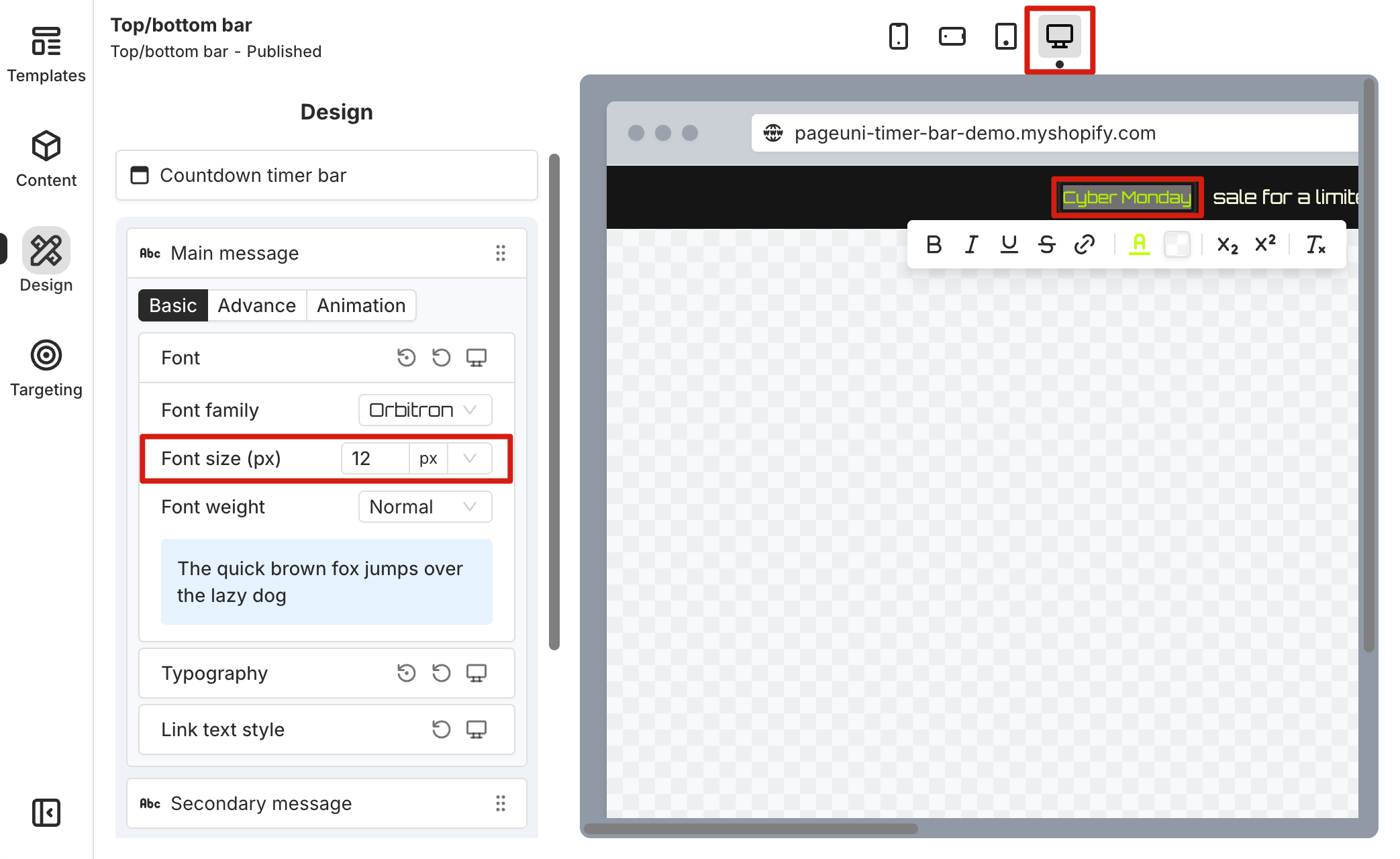
After creating the campaign, we selected a Cyber Monday template as the starting point for our timer bar design. Once the template was set, we switched to the Design tab in the timer bar builder to start customizing the look. By default, you’ll be designing for mobile devices first, and the preview area shows how the timer bar will look on a mobile screen.
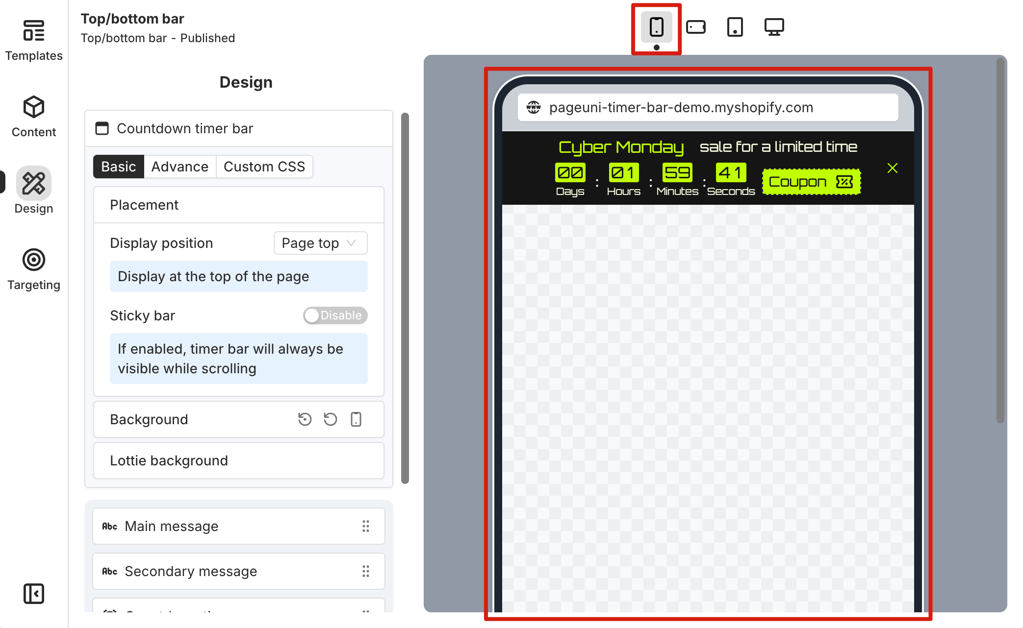
Currently, any changes you make in the mobile view apply to all device sizes. For example, we decided to reduce the font size of the timer bar elements, since the mobile preview showed that the original sizes looked too large for the campaign we were planning.
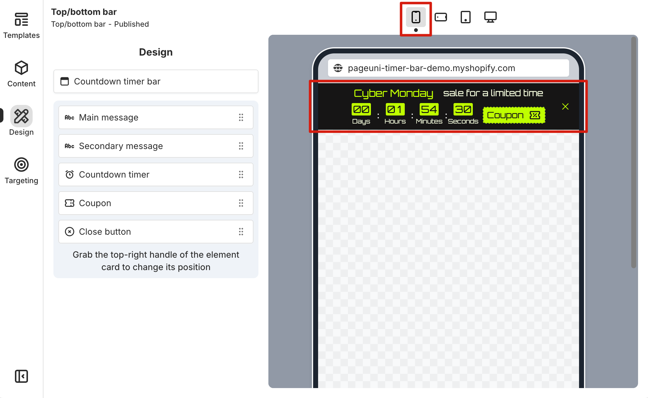
After making the changes, we switched to other device previews—like mobile landscape, tablet, and desktop—and noticed that the font sizes looked smaller there too. That’s one of the main ideas behind mobile-first design: if you don’t set anything different for larger screens, they’ll simply follow the mobile design.
When switching between devices, select the elements with adjusted font sizes and check the font size value in their design settings card. You’ll see that it matches the font size set in the mobile view. Here’s a helpful tip: by reviewing the design settings card for each element across different devices, you can easily see how the design adapts to various screen sizes.
By understanding mobile-first responsive design, we know that we should start most of our design work with mobile devices as the base. Make the majority of changes in the mobile view, and once the design meets your requirements on mobile, switch to larger devices to check if it works as expected. If necessary, make further adjustments to override the mobile design for those larger screens.
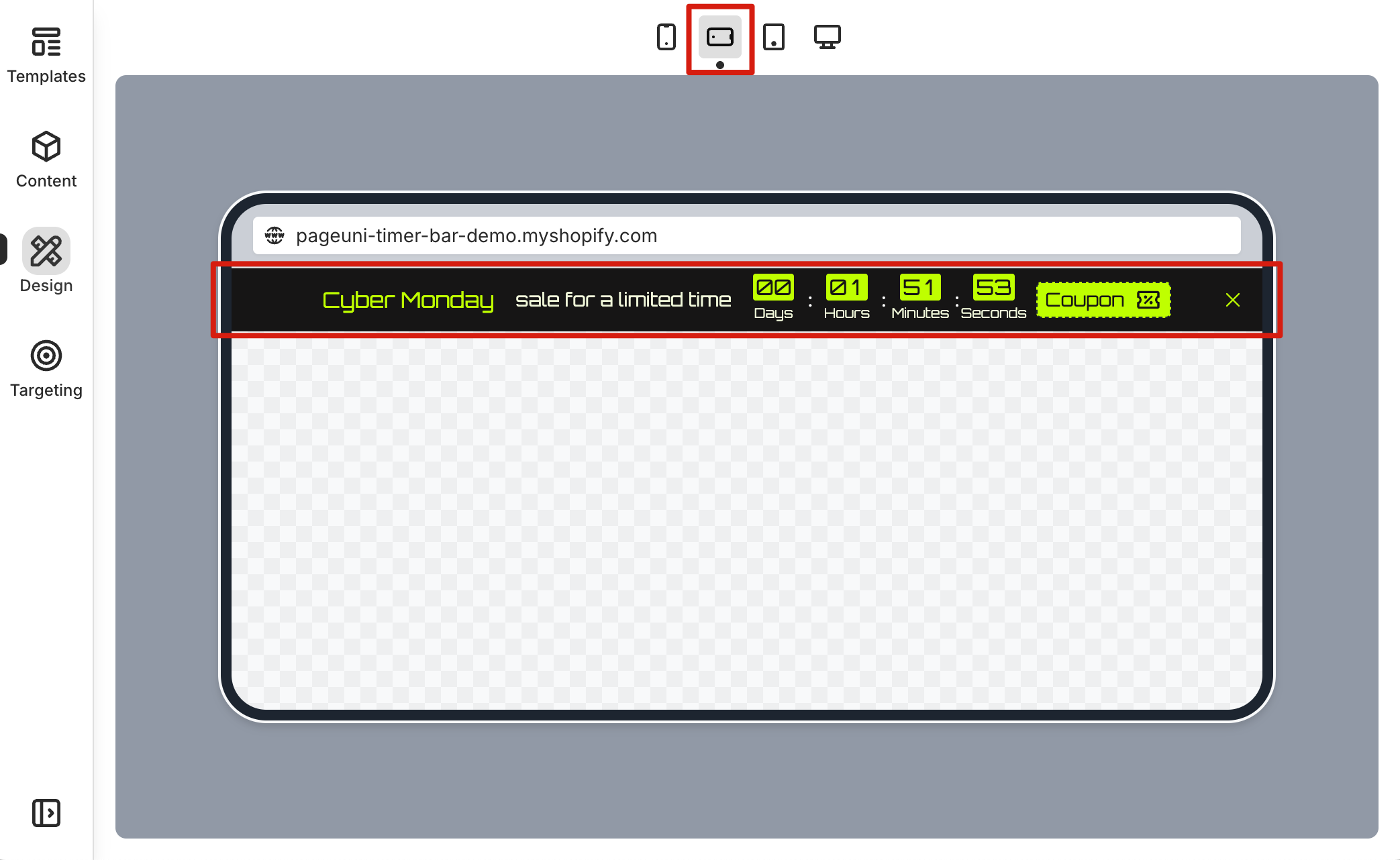
Next, we switched to the tablet view to check the design. We felt the font size needed to be slightly larger on this device, as the text might be hard for customers to read. So, in the tablet view, we increased the font size in the design settings card.
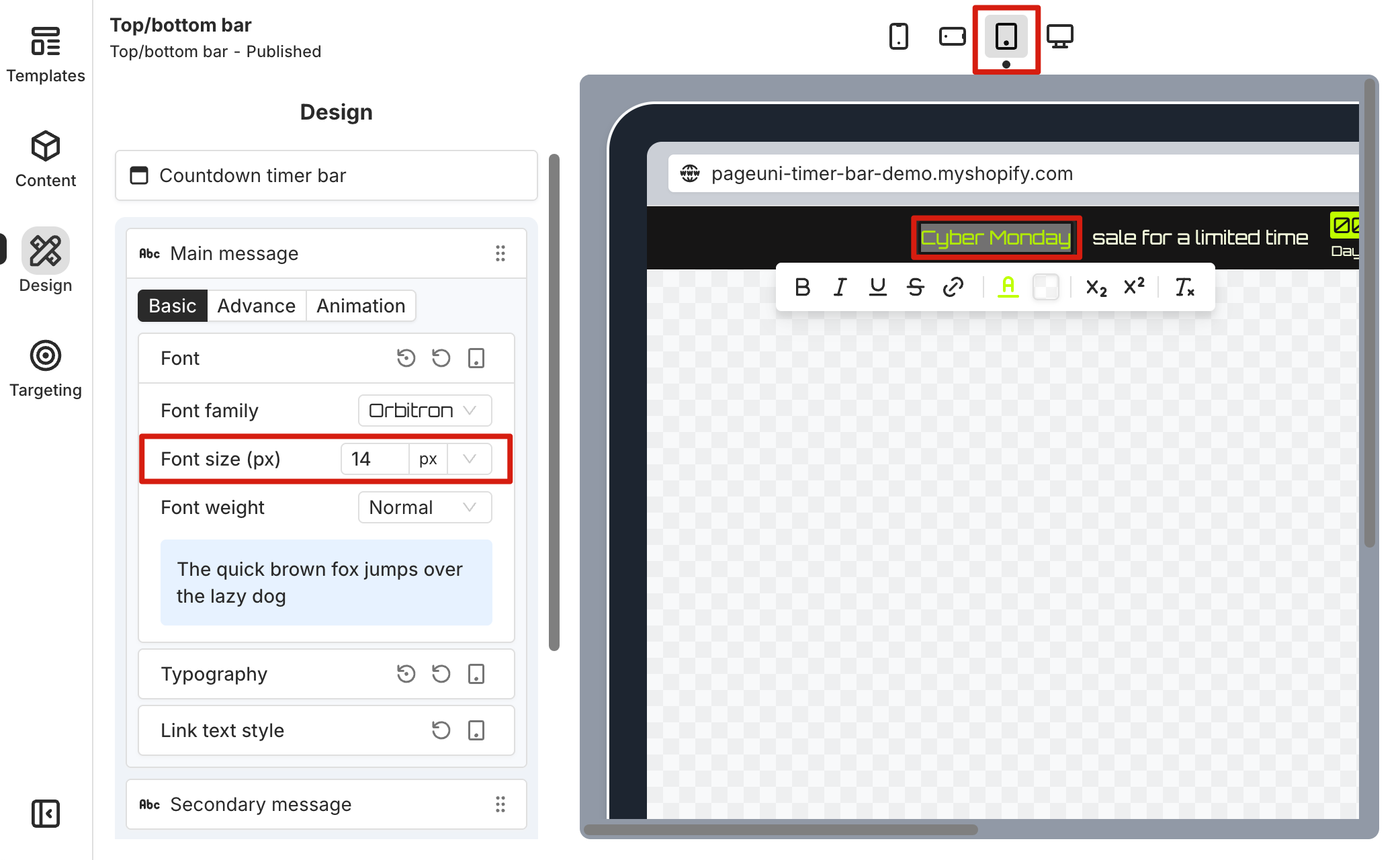
Now, when we switch back to the mobile and mobile landscape views, the original smaller font size is still there. But on the tablet and desktop views, the font size has been increased.
That’s a simple example of how mobile-first responsive design works in the timer bar builder, using font size as a case. Most of the design properties in the Design tab follow the same logic and workflow. Feel free to explore and try out your own design customizations.
Extra Tools
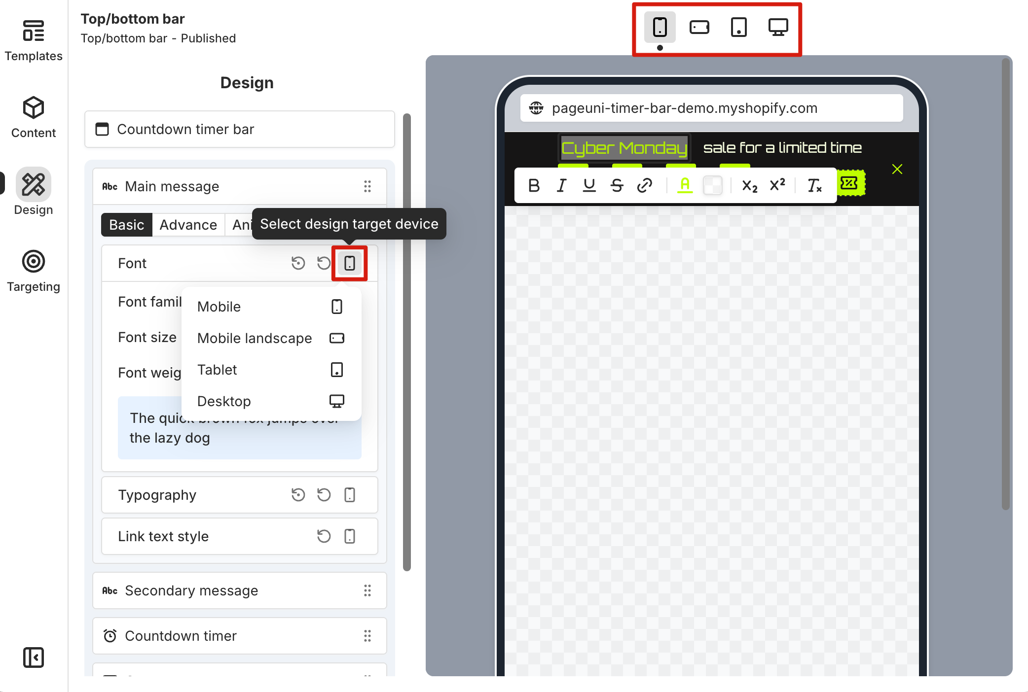
You can switch the responsive design device view in two places: from the top bar of the preview area, or from the top-right corner of the element’s design settings card.
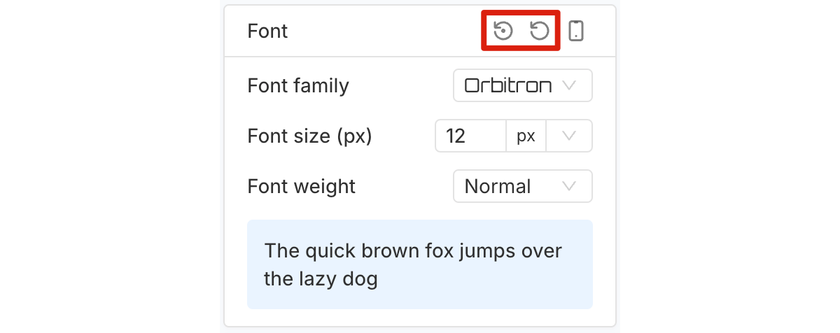
In the top-right corner of an element’s design settings card, there are reset buttons that allow you to reset your design changes. The first button resets the settings within the card for the current device only, while the second button resets all settings within the card across all devices.
Responsive Design Breakpoints
We use the following width ranges as breakpoints for responsive design:
-
Mobile: less than 768px
-
Mobile Landscape: 768px to less than 1024px
-
Tablet: 1024px to less than 1280px
-
Desktop: 1280px and above
These proven breakpoints ensure that your timer bar layout and style adjust smoothly across different screen sizes. If you need more breakpoint options, you can use our Custom CSS feature to set them up just the way you need.