PageUni Countdown Timer offers a wide range of design options for both the timer bar and its elements, including Basic Design Options and Advanced Design Options. In most cases, when starting from one of our templates, the Basic Options are enough to meet your customization needs. However, if you have more specific or advanced requirements, you can use the Advanced Options to make further adjustments.
In this article, we’ll walk you through the Advance Design Options.
Note: Before you start exploring the design settings, we suggest taking a quick look at how responsive design works in the timer bar builder.
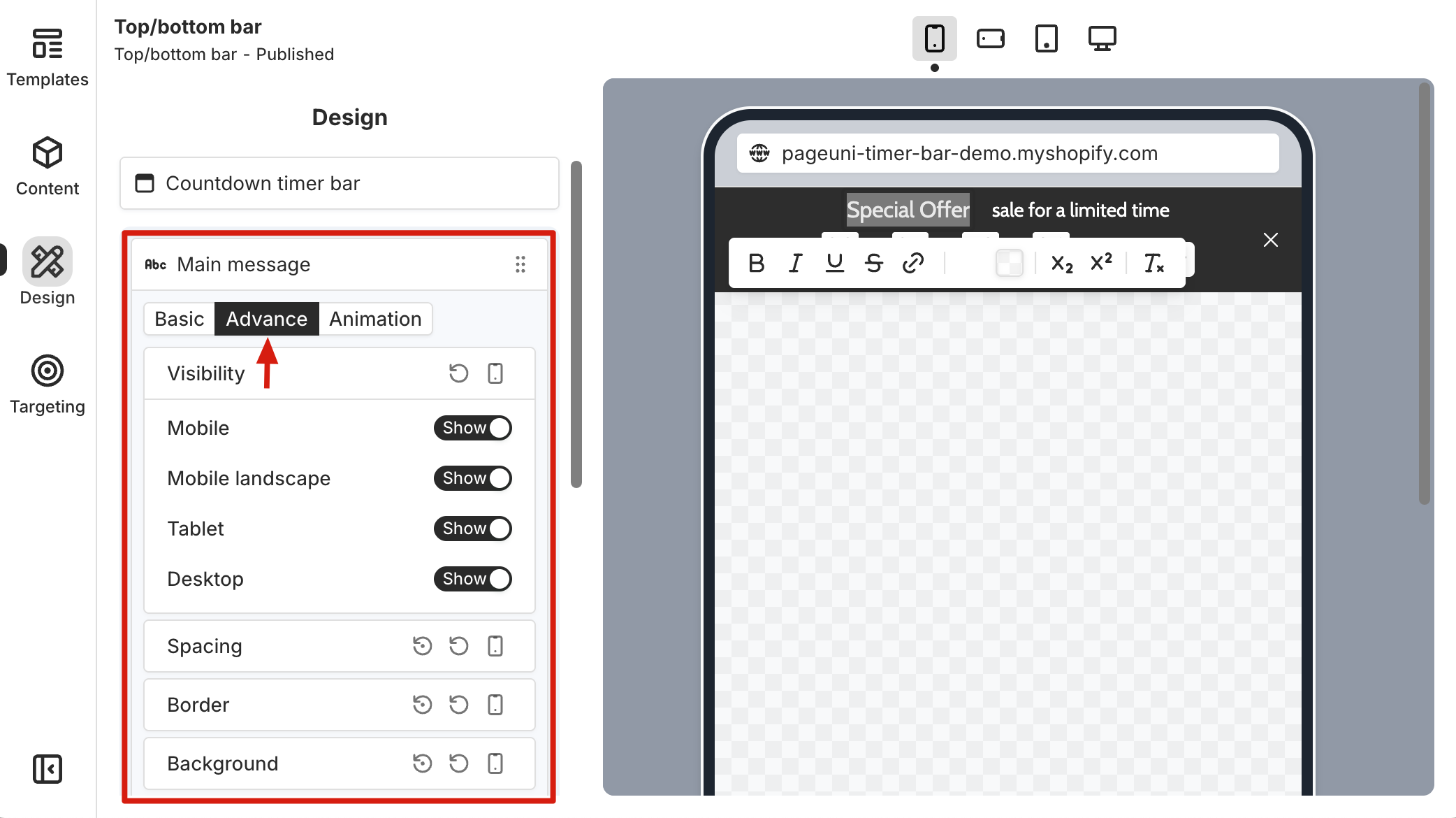
Both the timer bar and its elements support Advanced Basic Design Options. After entering the Design tab in the timer bar builder and selecting an element, click the "Advance" tab at the top of the element card to access these options.
Note: Most design options can be reset to default, so feel free to explore and make adjustments in the builder.
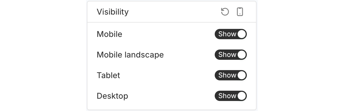
Visibility
Use the "Visibility" options to control whether the selected element shows on different devices. Just toggle each option on or off as needed.
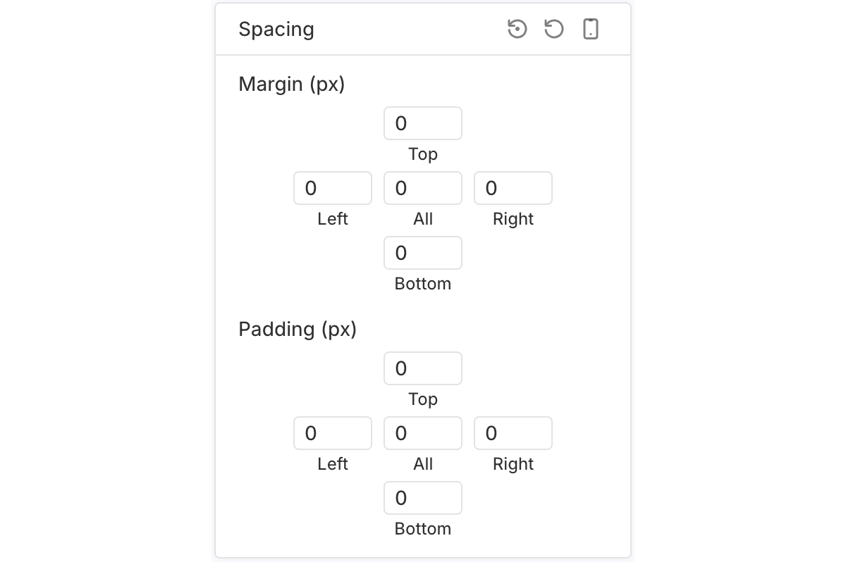
Spacing
The "Spacing" options let you control the margin and padding of the selected element.
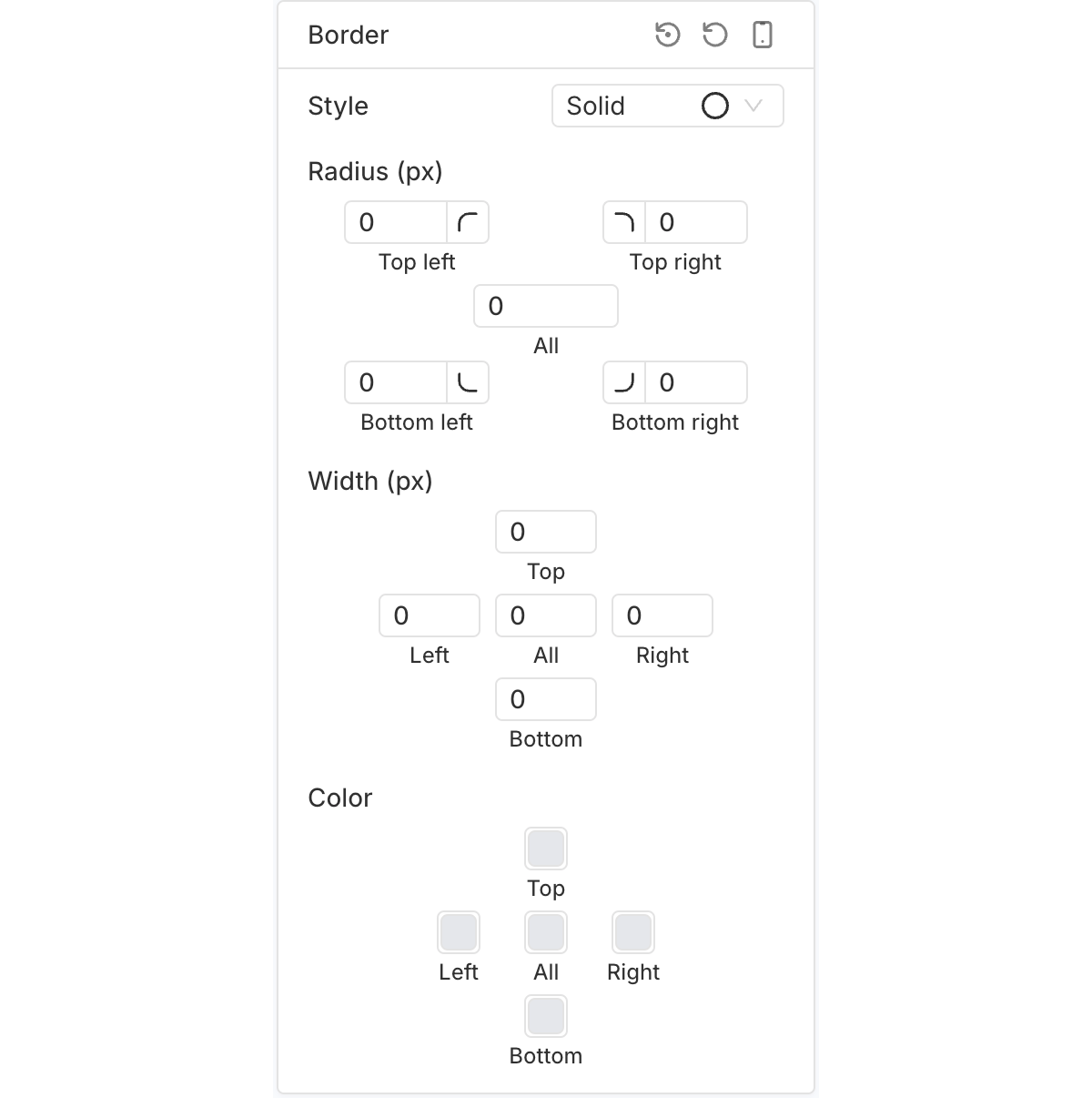
Border
Use the "Border" options to adjust the color, width, and corner radius of the selected element’s border.
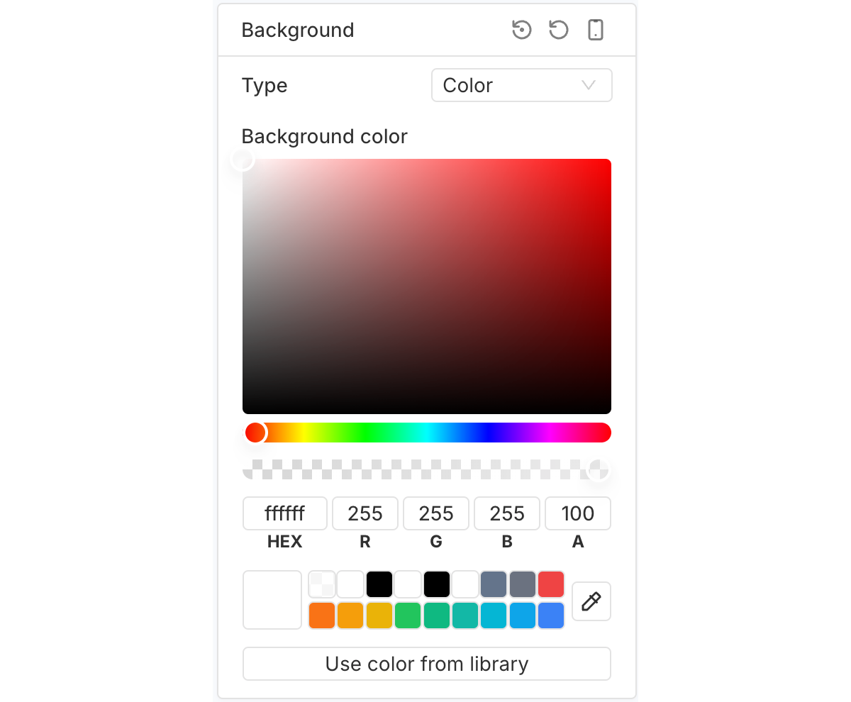
Background
The "Background" options let you set a background color, gradient, or image for the selected element.
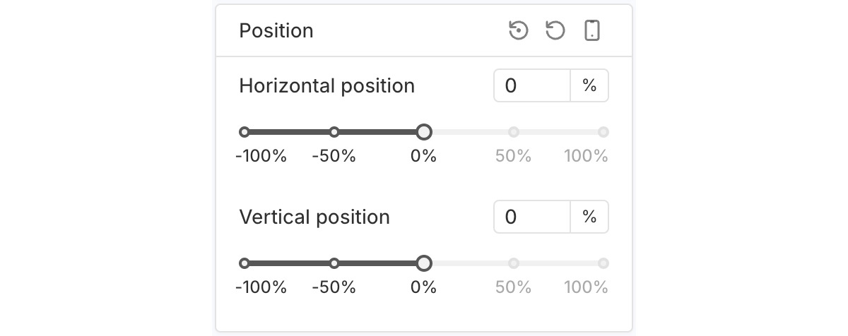
Position
The "Position" options let you adjust the placement of the selected element within the timer bar.
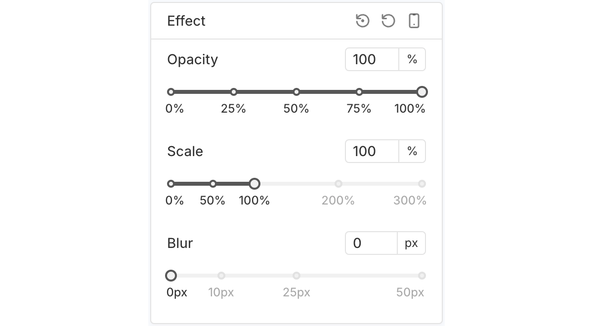
Effect
The "Effect" options let you customize the opacity, scale, and blur effects of the selected element.
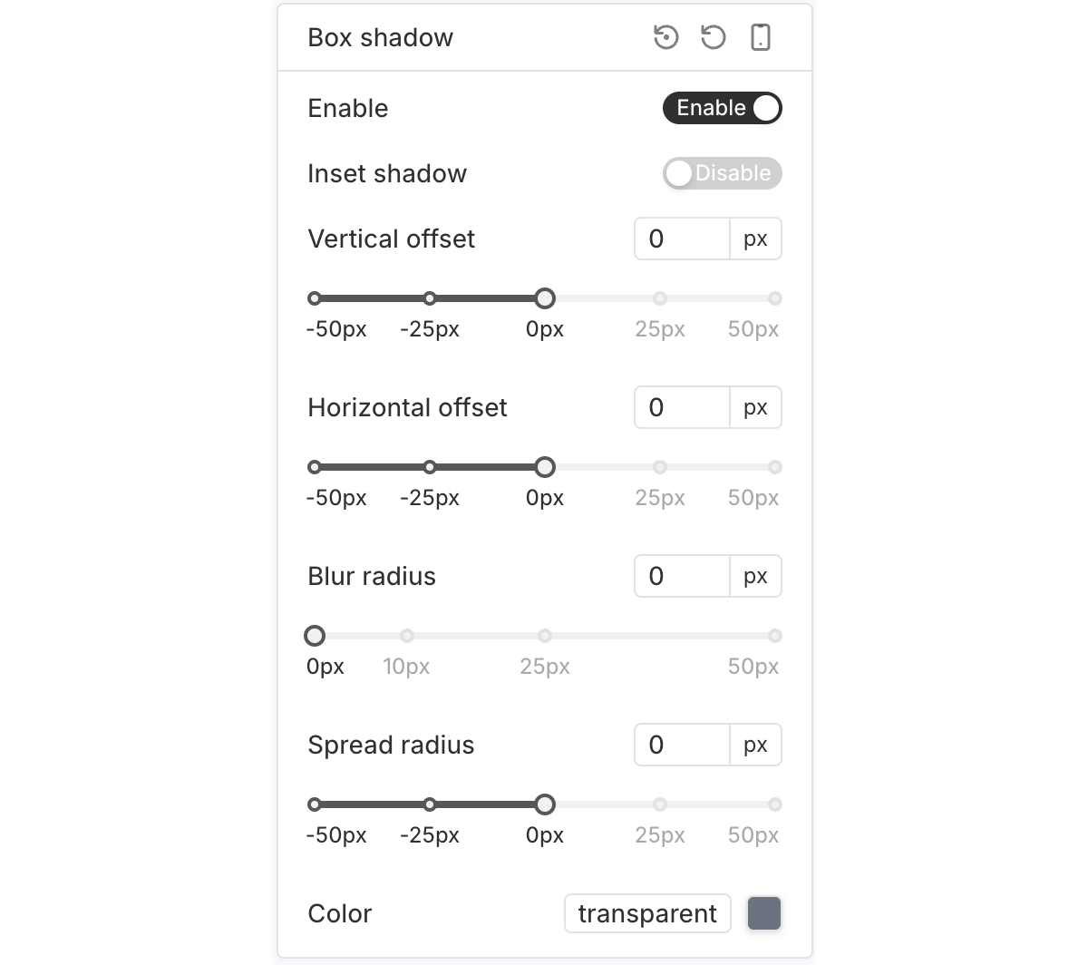
Box Shadow
The "Box shadow" options let you add and customize a shadow around the selected element’s container.
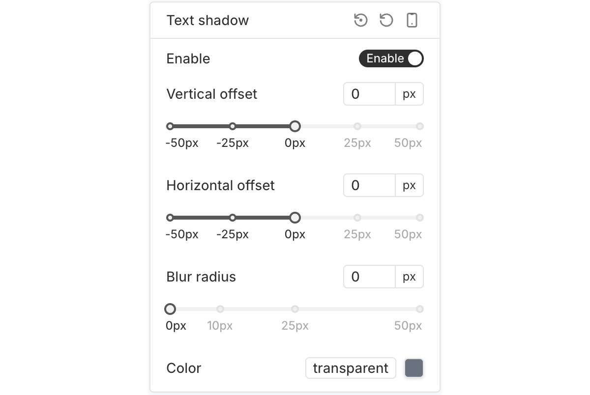
Text Shadow
The "Text shadow" options let you apply a shadow effect to the text content of the selected element.