PageUni Countdown Timer offers a wide range of design options for both the timer bar and its elements, including Basic Design Options and Advanced Design Options. In most cases, when starting from one of our templates, the Basic Options are enough to meet your customization needs. However, if you have more specific or advanced requirements, you can use the Advanced Options to make further adjustments.
In this article, we’ll walk you through the Basic Design Options.
Note: Before you start exploring the design settings, we suggest taking a quick look at how responsive design works in the timer bar builder.
Both the timer bar and its elements have their own Basic Design Options. For example, the Countdown timer element includes sections like "Timer style" and "Time unit labels font", while the Button and Coupon elements have option sections for customizing their icons.
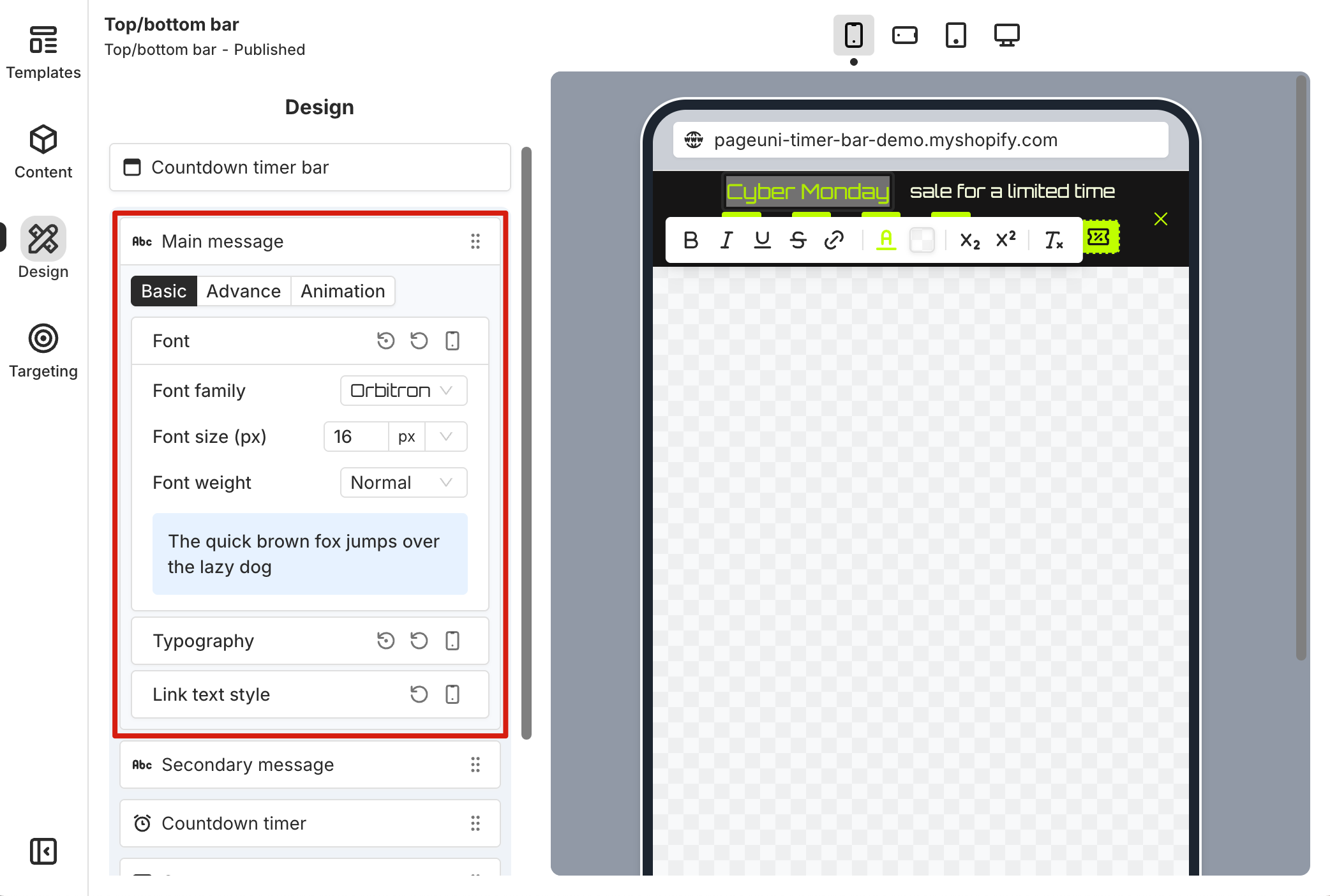
Once you enter the Design tab in the timer bar builder and select an element, you'll see these Design options.
Note: Most design options can be reset to default, so feel free to explore and make adjustments in the builder.
Countdown Timer Bar
The options in the "Countdown Timer Bar" card are used to customize the design of the entire timer bar.
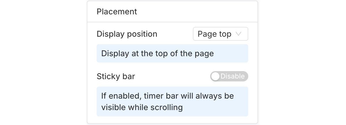
The "Placement" section lets you control where the timer bar appears on your store page. You can also use it to set a custom placement if needed.
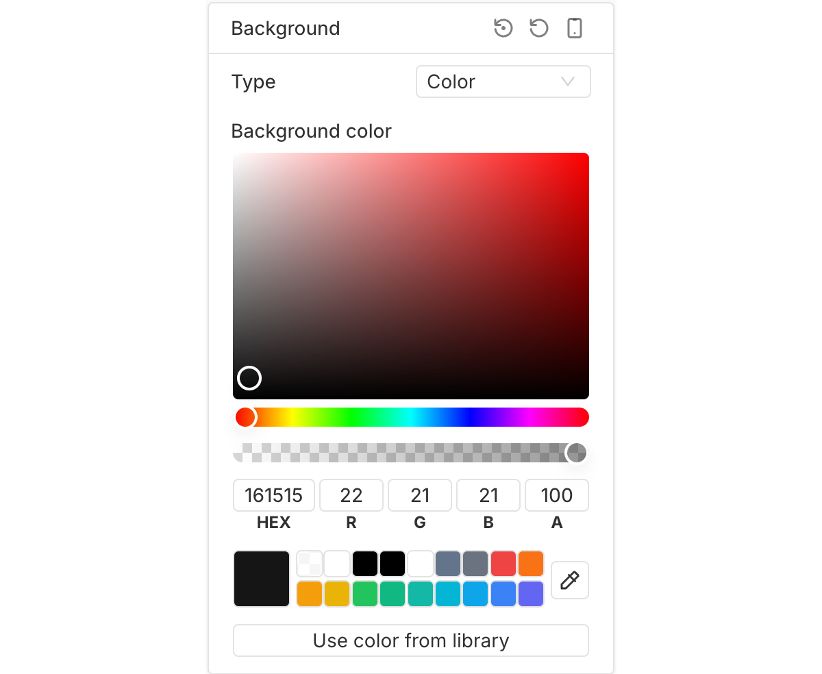
The "Background" section allows you to customize the timer bar’s background (color, gradient or image).
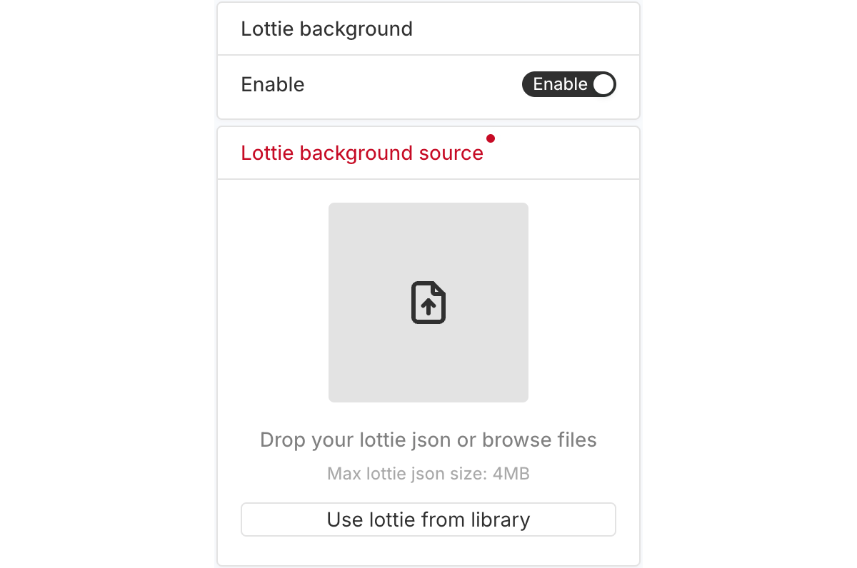
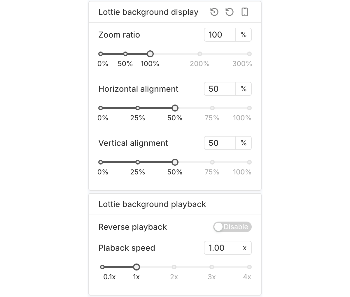
The "Lottie background" sections let you add a Lottie animation as the background of your timer bar.
Main Message
The "Main message" element displays the primary text content within the timer bar.
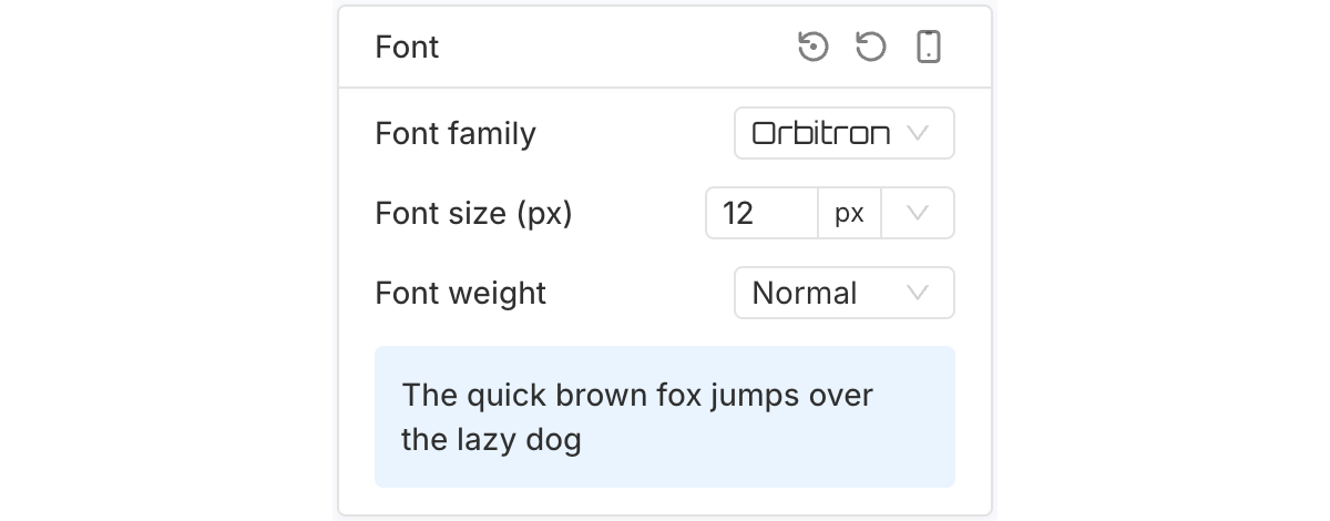
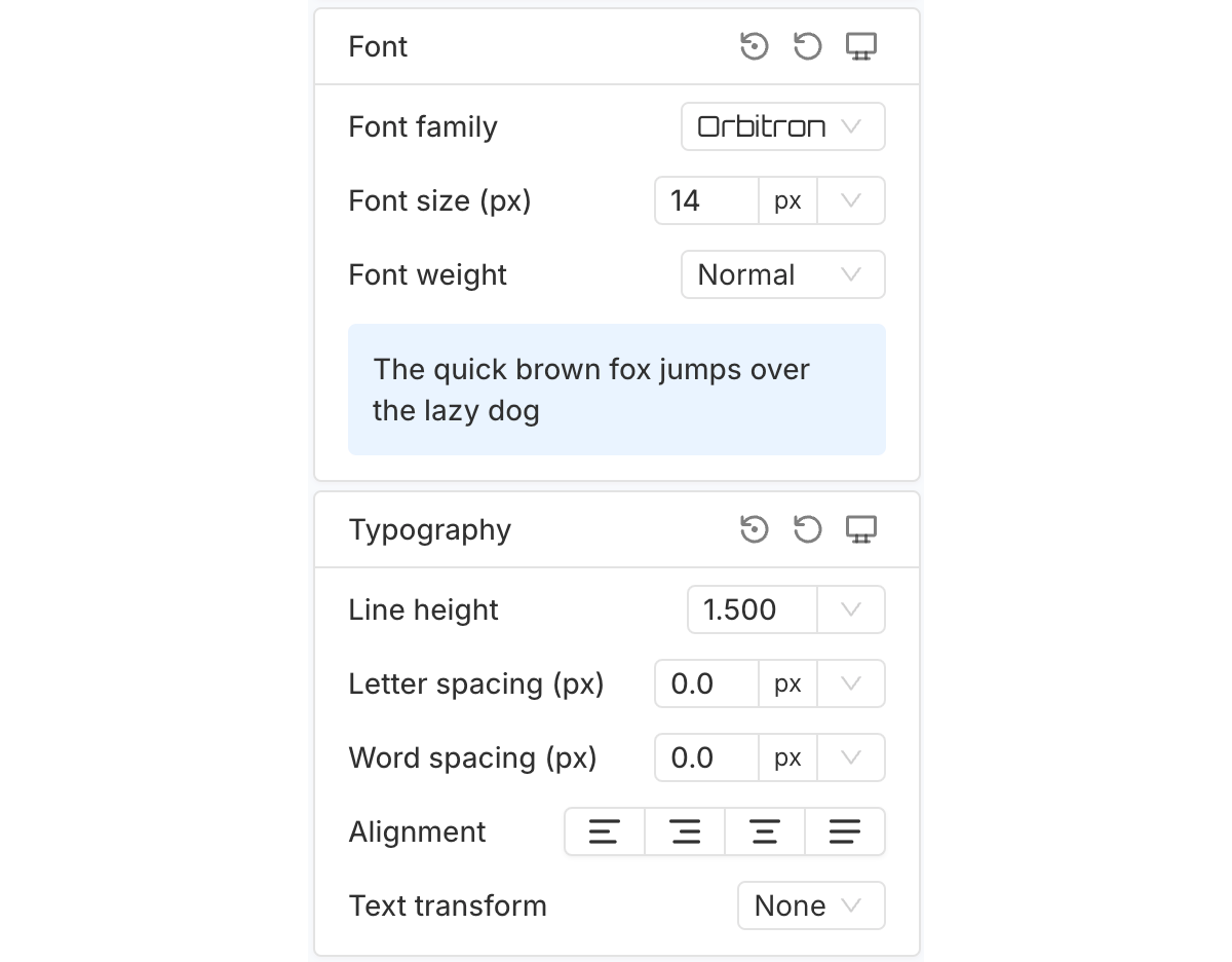
The "Font" section lets you customize key typography settings for the Main message, including font family, font size and font weight.
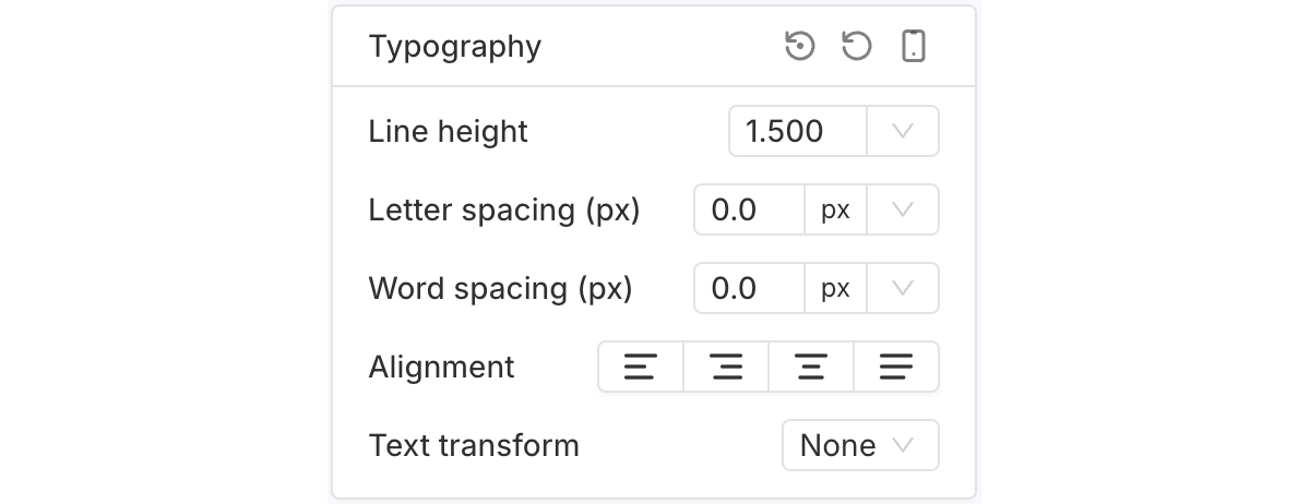
The "Typography" section lets you adjust the Main message’s line height, letter spacing, word spacing, alignment and text transform.
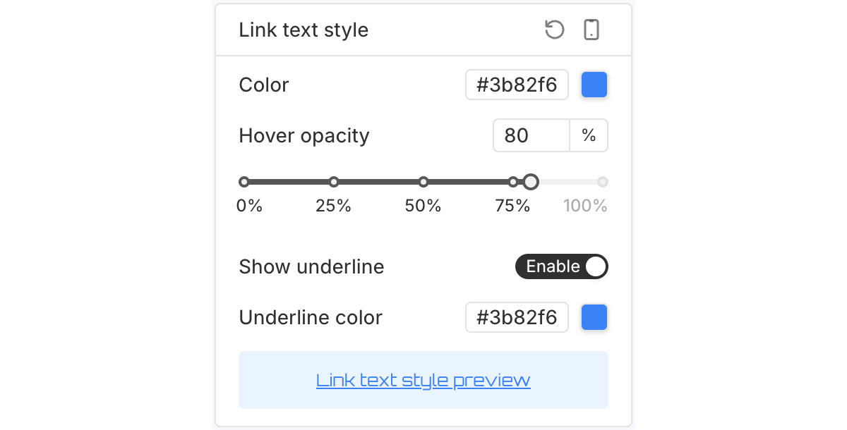
The "Link text style" section lets you customize the color and underline style of any link text within the Main message.
Note: For more information on editing and designing text content, refer here.
Secondary Message
The "Secondary message" element displays the secondary text content within the timer bar. Its design options are the same as those for the Main message.
Countdown Timer
PageUni Countdown Timer offers highly customizable settings for the "Countdown timer" element.
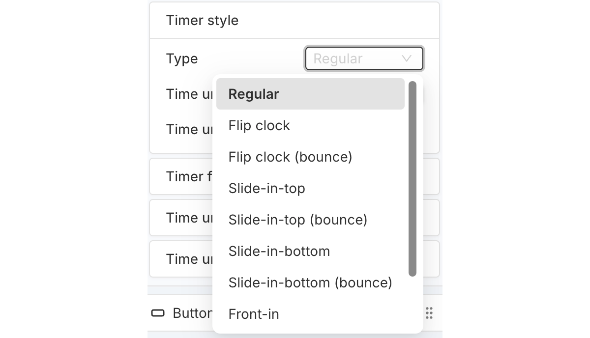
The "Timer style" section lets you customize the timer's style type (like flip clock), time unit color, and time unit corner radius.

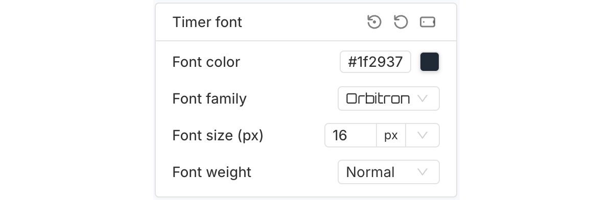
The "Timer font" section lets you customize the font used for the numbers in the timer.

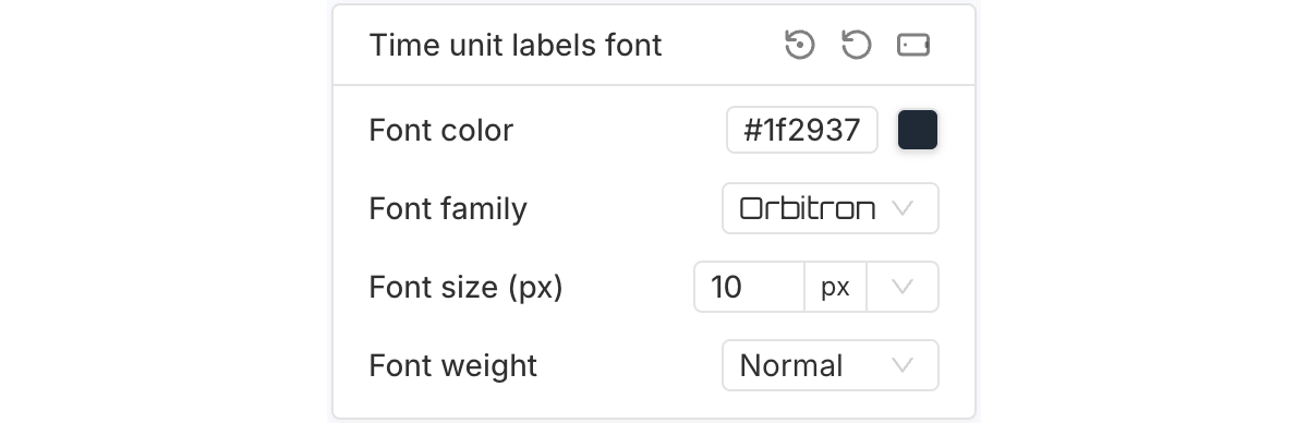
The "Time unit labels font" section lets you customize the font used for the time unit labels (like days, hours, minutes, and seconds).

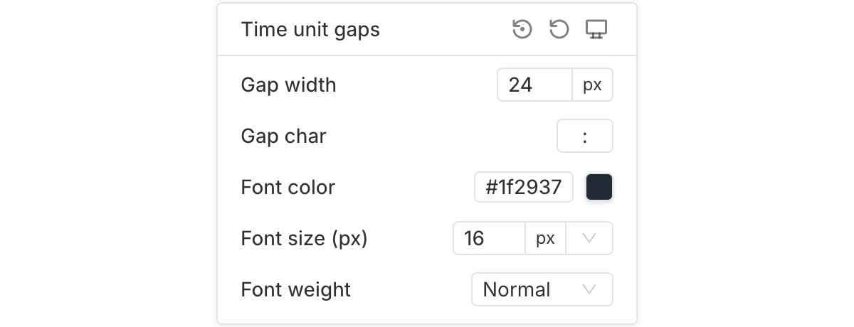
The "Time unit gaps" section lets you customize the gaps between time units. You can adjust the gap width, gap character, and set the font color, size, and weight.

Button
The "Button" element is typically used as the timer bar’s call-to-action (CTA), guiding users to a target page.
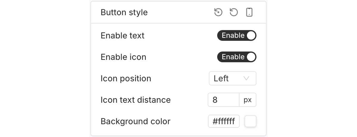
The "Button style" section lets you choose whether to show text, an icon, or both—for example, you can create an icon-only button if needed. You can also adjust the icon position, spacing between the icon and text, and the button’s background color.
The "Font" and "Typography" sections let you customize the design of the text inside the button.
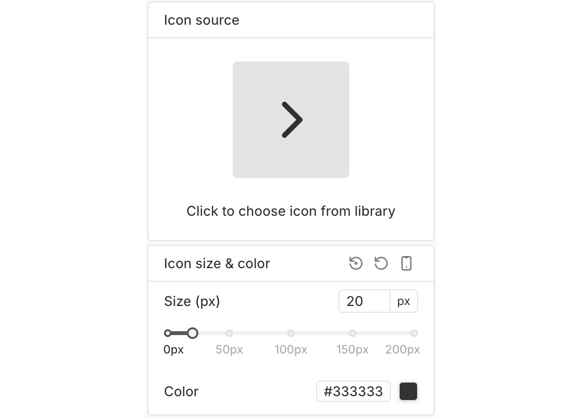
The "Icon source" and "Icon size & color" sections let you choose which icon to use and customize its appearance.
Coupon
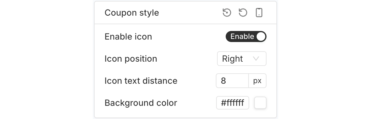
The "Coupon" element serves as the timer bar’s CTA, allowing users to quickly access a discount code.
The "Coupon style" section lets you choose whether to show an icon, adjust the icon position, set the spacing between the icon and text, and change the coupon’s background color.
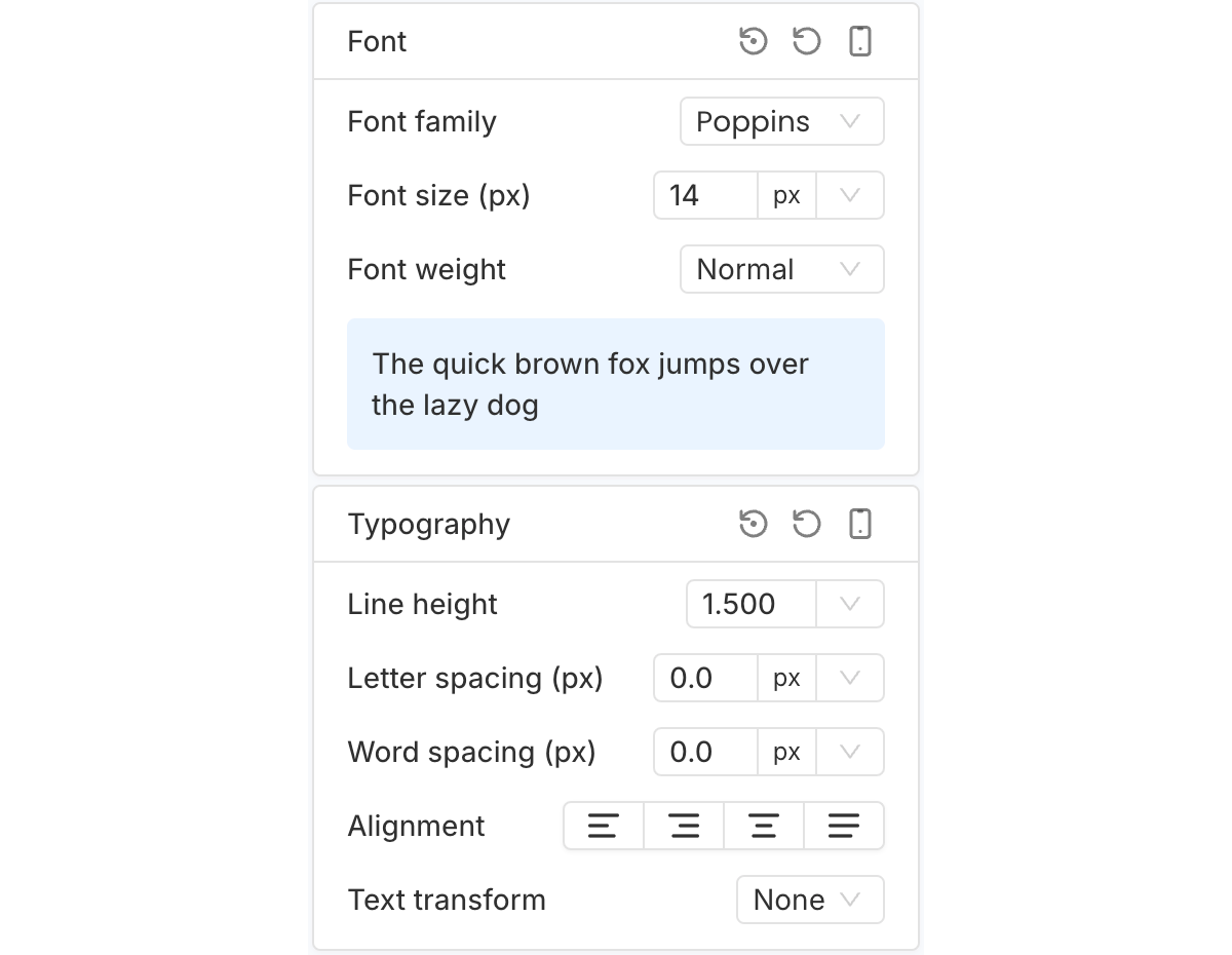
The "Font" and "Typography" sections let you style the text inside the Coupon element.
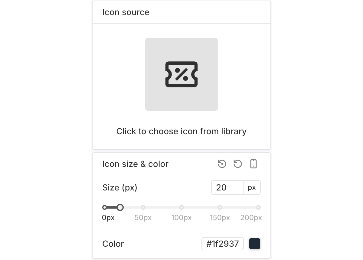
The "Icon source" and "Icon size & color" sections let you choose which icon to use and customize its appearance.
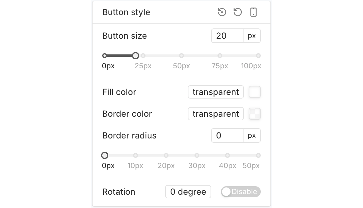
Close Button
The "Close button" lets users click to close the entire timer bar.
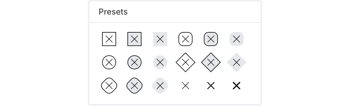
The "Presets" section lets you quickly style the Close button by choosing a preset.
The "Button style" section lets you set the Close button’s size, fill color, border color, border radius, and rotation.
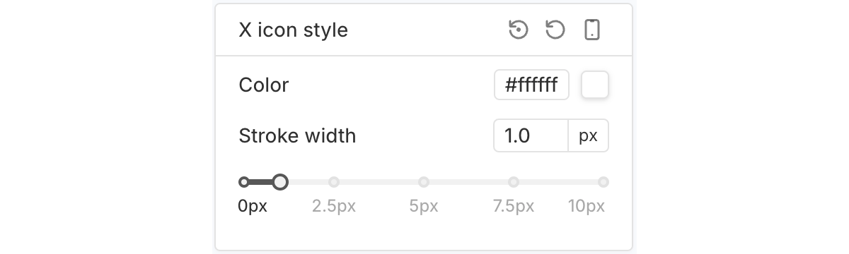
The "X icon style" section lets you customize the "x" inside the Close button, including its color and stroke width.